Contributed by: Seppe vanden Broucke
Read an abbreviated version of this article at KDNuggets!
This article also appeared in Data Science Briefings, the DataMiningApps newsletter. Subscribe now for free if you want to be the first to receive our feature articles, or follow us @DataMiningApps. Do you also wish to contribute to Data Science Briefings? Shoot us an e-mail over at briefings@dataminingapps.com and let’s get in touch!
Introduction
Today’s organizations employ a wide range of information support systems to support their business processes. Such support systems record and log an abundance of data, containing a variety of events that can be linked back to the occurrence of a task in an originating business process.
The field of process mining starts from these event logs as the cornerstone of analysis and aims to derive knowledge to model, improve and extend operational processes “as they happen” in the organization. As such, process mining can be situated at the intersection of the fields of Business Process Management (BPM) and data mining.
Also read our earlier article, “Closing the Loop: State of the Art in Business Process Analytics“, for a wider introduction to BMP, process intelligence, and process mining.
Process mining aims to offer a comprehensive set of tools to provide process-centered insights and to drive process improvement efforts. The field strongly emphasizes a bottom-up approach, starting from real-life data to drive analytical tasks. The most well-known task within the area of process mining is called process discovery (sometimes also called process identification), where analysts aim to derive an as-is process model, starting from the data as it is recorded in process-aware information support systems, instead of starting from a to-be descriptive model and trying to align the actual data to this model. A significant advantage of process discovery is the fact that only a limited amount of initial data is required to perform a first — exploratory — analysis.
Process mining builds upon existing approaches, and intersects not only with BPM, but also data mining, business intelligence and many others. However, the particular setting and requirements that come with event data has led to the creation of various specific tools and algorithms. Compared to traditional data mining, where an analyst works (most frequently) with a flat table of instances, process mining starts from a hierarchical and intrinsically ordered data set. Hierarchical as an event log is composed out of multiple trails recording the execution of one process instance, which in itself is composed out of multiple events. These events are ordered based on their order of execution. A prime use case in process mining is hence to abstract this complex data set to a visual representation, a process model, highlighting frequent behavior, bottlenecks, or any other data dimension that might be of interest to the end user.
Traditional data mining tooling like R, SAS, or Python are powerful to filter, query, and analyze flat tables, but are not widely used by the process mining community to achieve the aforementioned tasks, due to the atypical nature of event logs. Instead, an ecosystem of separate tools has appeared, including, among others:
- Disco, by Fluxicon, which can create nice looking process maps and animations, is fast and has strong filtering capabilities. It remains one of the more popular commercial process mining tools
- Minit, a tool that is rapidly gaining in popularity, offering similar insights and capabilities as Disco
- ProcessGold (before: Lexmark Process Mining, also before: Perceptive Process Mining, also before: Futura Reflect and also before: BPM|one — this one has been renamed a lot): also offers similar capabilities. No demo or trial available, though
- Celonis Discovery: cloud based tool also similar to the above. Not that powerful or advanced due to its cloud based nature, however
- ProM: “the academics choice”, open source and free. Contains many powerful plugins you’ll want to use in case you want to execute bleeding edge algorithms or something else than standard process discovery (e.g. conformance checking or process enhancement). Comes with a steep learning curve and stability issues, however, so you need to know what you’re doing
- Others, like ARIS Process Performance Manager, QPR ProcessAnalyzer, Interstage Process Discovery, XMAnalyzer, etc. Most of these are not widely used or known
In this article, we want to deviate from using these tools, and instead provide a quick whirlwind tour on how to create rich process maps using R. This can come in helpful in cases where the tools listed above might not be available, but also provides hints on how typical process mining tasks can be enhanced by or more easily combined with other more data mining related tasks that are performed in this setting. In addition, the direct hands-on approach of working with data will show that getting started with process discovery is very approachable. Let’s get started.
Process Maps
Our main goal is to use R to create appealing process maps similarly as done by Disco and other similar tools. To do so, however, we first need to know how exactly such visual models are constructed, starting from an event log.
At the most basic level, an event log can be represented as a collection of traces, logged sequences of activities. The following might hence be a very simple event log:
<a,b,c,o,o,o,z>
<a,b,c,o,o,z>
<a,c,b,o,z>
<a,c,b,o,o,o,o,z>
<a,d,o,o,o,z>
<a,d,o,z>
<a,d,z>
The goal is now the abstract this collection of traces to a visual representation — a model — which naturally represents as well as possible the behavior captured by the original data set. In general, we want models to fit tightly around a given event log: supporting well the behavior found in the event log, but not being so general and broad that it becomes imprecise.
The amount of abstractions that can be made in the construction of a process model also depend on the basic building blocks the representation supports. Many process discovery techniques construct process models in the form of Petri nets, but in general, most process model representations support sequences, choices, parallelism, loops, and skips.
Using these building blocks and the example event log above, there are already a lot of ways how a “smart” discovery algorithm might try to represent the event log in a good, visual model:
- All traces start with a and end with z, so the model should place corresponding activities at the start and end
- After a, it seems that either b and c appear together, or d on its own. We probably want to make a choice at this point between these two possibilities
- B and c seem to have no strict ordering among them. We might think about constructing this as a sequence where we first choice between b or c and then follow up b with c and c with b, but this can also be seen as evidence for parallelism between them
- Activity o looks like a recurrent activity that can be repeated multiple times. We probably want a loop here
- Activity o can occur independent from which choice was made before, but we do see that it always occurs at least once when the b and c path was followed. In addition, we do have one trace showing evidence that is can be skipped over in case the path for d was followed. Does this mean that o is always optional, or only optional when d was chosen before?
As we observe, even for this simple event log, we can come up with a lot of ways to represent this behavior in a model. The below figures show two ways of how we might “discover” a model for this given event log, using Petri nets and a representational language (no worries if Petri nets look a bit daunting, we’ll forego them soon enough):
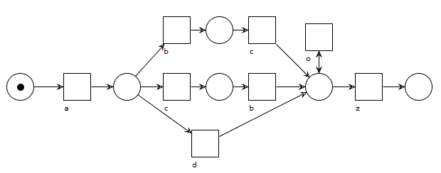
A model with no parallelism, but with duplicate activities that look a bit unappealing and hide the choice between b-and-c and d somewhat. Activity o loops but is always optional no matter what was done earlier in the process.
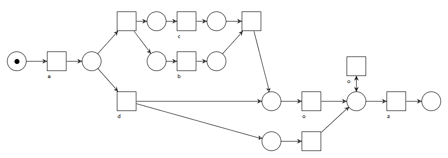
A model with a parallel construct between b and c to indicate their flexible ordering. Activity o has to execute at least once in this model, except when activity d was chosen previously, in which case o can be skipped altogether. Duplicate and invisible task labels are required here to represent this behavior using Petri nets, constructs most discovery algorithms cannot handle well.
This simply example illustrates the challenge that comes with thinking up new process discovery algorithms: how well can we make them perform in terms of abstracting behavior and constructing rich model constructs? How can we do so while still making sure that models are easy to read for humans? Do we need to make sure that we can capture all behavior from the given event log, or should we assume that low-frequent behavior is noisy or not important and work with the high-frequent behavior only?
This being said, most commercial process discovery tools take another approach entirely, where a very simple model representation is used together with a “what you give is what you get” mining approach, where no “smart abstractions” are made by the tool. This has the benefit that users will not get confused by particular choices made by the discovery algorithm that they cannot “recognize” or justify in the resulting model, and instead can regard models as a pure, visual representation of all the pathways stored in the event log that was used to construct it. The downside of this approach is that this can quickly lead to very messy, spaghetti-like models or models where it might be hard to get an abstract, high-level overview of the permitted behavior without applying additional filtering.
Let’s illustrate this with some trivial event logs which we’ll mine using Disco. Let’s start with the following log (assume all activities are instant and have no duration, for now):
<a,b,c,d>
<a,c,b,d>
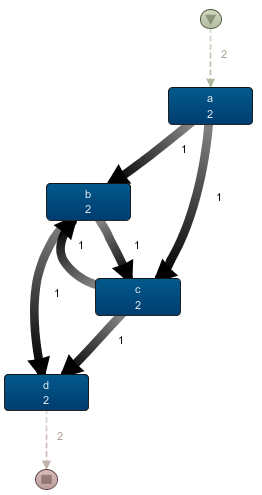
After importing it in Disco, we get the following process map:
It is clear here by inspecting the frequency numbers and layout that Disco has just drawn every sequence arc between activities found in the event log. As such, frequency (or time performance) analysis can — in this case — easily be done in, say, Excel too.
Most academic process discovery tools, however, like Alpha Miner, would construct a Petri net where some abstraction is already applied. That is, most of these would infer a parallel construct between b and c as a means to indicate the flexible order of execution between these two activities.
The process map shown here is certainly easy to read, but does show some “gotcha’s” that might occur when reading process maps at a glance. For instance, an analyst might infer that the b <-> c arcs shown here indicate ping-pong behavior, even although this does never occur in the given event log (that is, b->c->b or c->b->c never occur). This is easy to spot when looking at the frequency counts in the process map or applying some additional drill-down filtering, but does show to be careful when reading visuals.
Let us try a different log, adding a few extra traces to the ones above:
<a,b,c,d>
<a,c,b,d>
<a,b,c,b,d>
<a,b,c,b,c,b,d>
<a,b,d>
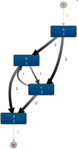
When mining this model with Disco, we obtain a very similar result. Indeed, the layout of the map has remained the same, with only the frequencies on the arcs and boxes having changed:
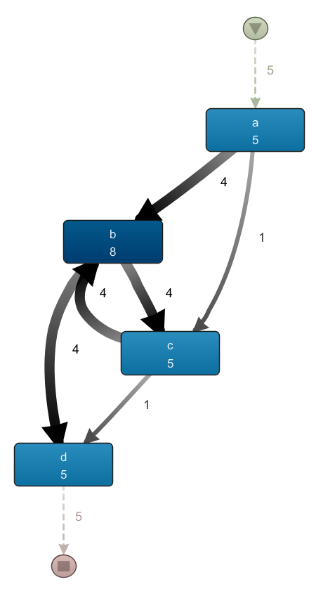 Again, the fact that this event log — which does have ping-pong behavior and does have traces where b occurs without c — results in a process map similar to the previous one illustrates once more to carefully inspect the result to see what’s going on.
Based on the examples above, the actual “algorithm” behind drawing up process maps is not that hard. Indeed, we just iterate over the traces in the event log and draw an arc between every pair of subsequent activities. Disco and similar tools will not attempt to abstract away any behavior, for instance by introducing a parallel split in the images above.
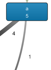
Recall that the fragment on the left side shows that the outgoing arcs of a indicate a choice, and not a parallel relation, as the number of occurrences of a (5) equals the number of outgoing arcs. In the case of parallelism, the frequency of the outgoing arcs would be above that of a itself, as a would be followed by the activation of multiple concurrent paths.
Does this mean that Disco will never infer parallelism? Not really. To do so, we need to introduce activities with durations in our event log. The actual durations do not really matter, but rather the ordering of the start and end of each activity. Let’s take a look at some examples:
<a, b-start, b-end, c-start, c-end, d>
As b completes before the start of c, no parallelism will be introduced

<a, b-start, c-start, c-end, b-end, d>
This is more interesting, since the durations overlap, parallelism will be introduced
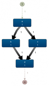 How exactly is the latter case handled in Disco? As the corresponding process map on the left shows, parallelism is present here: there are no arcs between b and c anymore, there are two outgoing arcs of a which is higher than the frequency of a itself. If we would animate this view, we’d also see a case splitting up in two after passing a. Other than that, Disco does not really emphasize the fact that a‘s split and d‘s join involve parallelism, rather than a choice.
The way how this is mined is as follows: for every activity in a trace, we need to figure out (i) the preceding activity, i.e. the activity that stopped most recently before the start of this activity and (ii) the following activity, i.e. the activity that started most quickly after the completion of this activity:
- For a, there is no preceding activity, b is the first activity starting afterwards. We hence add a->b
- For b, a was the last preceding activity, d is the first activity starting after its completion. We hence add a->b (already in the map) and b->d
- For c, a was the last completed preceding activity, d is the first activity starting after its completion. a->c and c->d are added
- For d, b was the last completed preceding activity, we add b->d (already in the map)
One final aspect to keep in mind is that splits and joins in Disco can allow for all sorts of behavior. That is, they do not necessarily indicate a complete parallel split/join or exclusive choice split/join. Take for instance the following event log:
<a, b-start, c-start, c-end, b-end, d>
<a, b-start, b-end, c-start, c-end, d>
<a, c-start, c-end, b-start, b-end, d>
Only the first trace has overlapping durations, as before. The next two traces do not have overlapping durations, but do all contain b and c. Indeed, many process discovery algorithms would summarize these traces by inferring a parallel relationship between b and c, resulting in a process looking similar as the process map just seen above. In Disco however, all these behaviors are “mixed” in an explicit manner, where every trace is parsed separately to construct the global map view:
Here, getting a good idea at the various combinations that might occur from the a-split gets more tricky. Is this always parallel? Sometimes a choice between b and c? This becomes more pronounced once you start working with event logs having splits involving more than two activities. Careful interpretation is hence important.
* * *
Nevertheless, process maps are a very easy to construct method to view and work with event logs. Now that we know how they work, let’s try to replicate them using R.
Process Maps with R
We pick R here as our “working language” as the fluidity of modern R (i.e. the “tidyverse” packages, with especially “dplyr“) makes for a relatively readable and concise approach, though there is no reason why other tools such as Python wouldn’t work just as well.
We’re going to use the “example event log” provided by Disco as a running example.
First, we load in some libraries we’ll need and define a few helper functions for later on:
# Load in libraries
library(tidyverse)
library(igraph)
library(subprocess)
library(png)
library(grid)

# Returns the max/min of given sequence or a default value in case the sequence is empty
max.na <- function(..., def=NA, na.rm=FALSE)
 if(!is.infinite(x<-suppressWarnings(max(..., na.rm=na.rm)))) x else def

min.na <- function(..., def=NA, na.rm=FALSE)
 if(!is.infinite(x<-suppressWarnings(min(..., na.rm=na.rm)))) x else def

# Simple helper functions for time formatting
kSecond <- 1
kMinute <- kSecond * 60
kHour <- kMinute * 60

formatDurationHour <- function(s) {
 sprintf("%.0fh%s", floor(s/kHour), formatDurationMinute(s %% kHour))
}

formatDurationMinute <- function(s) {
 ifelse(s > kHour,
 formatDurationHour(s),
 sprintf("%.0fm%ss", floor(s/kMinute),
 format((s %% kMinute) / kSecond, digits=9, scientific=F)))
}

formatSeconds <- function(s) {
 prefix <- ifelse(s < 0, "-", "")
 s <- abs(s)
 paste(prefix, formatDurationMinute(s), sep="")
}
Next, we read in the event log file and create two columns containing the start end completion times per row in R’s POSIX datetime format by parsing the existing datetime strings:
eventlog <- read.csv('c:/users/seppe/desktop/sandbox.csv', sep=';')
eventlog$Start <- as.POSIXct(strptime(eventlog$Start.Timestamp, "%Y/%m/%d %H:%M:%OS"))
eventlog$Complete <- as.POSIXct(strptime(eventlog$Complete.Timestamp, "%Y/%m/%d %H:%M:%OS"))
Next up is the key step of the process. Recall that for every event in the event log, we want to figure out (i) the preceding activity, i.e. the activity that stopped most recently before the start of this activity in the same case and (ii) the following activity, i.e. the activity that started most quickly after the completion of this activity in the same case. Using dplyr, we’re going to assign an increasing row number to each event and use that to construct two new columns to refer to the following and previous event in the event log:
eventlog %<>%
 mutate(RowNum=row_number()) %>%
 arrange(Start, RowNum) %>%
 mutate(RowNum=row_number()) %>%
 rowwise %>%
 mutate(NextNum=min.na(.$RowNum[.$Case.ID == Case.ID & RowNum < .$RowNum & .$Start >= Complete])) %>%
 mutate(PrevNum=max.na(.$RowNum[.$Case.ID == Case.ID & RowNum > .$RowNum & .$Complete <= Start])) %>%
 ungroup
Note: “%>%” is the pipe operator in R as introduced by the tidyverse. Basically, it allows for a more fluent coding style where e.g. “head(filter(data, Col == 2))” can be written as “data %>% filter(Col == 2) %>% head”.
This list of operations might look a bit daunting, but is actually quite simple. First, we add in a “RowNum” column which simply assigns a line number per event using the original ordering from the given event log. We then sort the event log based on starting times. When two events have the same starting time, we want to make sure they retain their original ordering, hence the use of “RowNum”. Once the event log is sorted, we can then re-assign the “RowNum” values based on the new, ordered event log. Next, we create two new columns, “NextNum” and “PrevNum” as follows:
- For “NextNum”, take the smallest “RowNum” value (the “.” dot refers to the whole data set) from those where the case identifier matches the current event’s case identifier (we make sure “Case.ID”, “RowNum” and “Complete” refer to the current line only by first applying a “rowwise” grouping), but where the row number is larger (i.e. comes after) than the current event’s row number, and where the starting time follows the current event’s completion time. If no such row number can be found, just assign NA. Think of this as “the event that starts just right after my completion”
- For “PrevNum”, take the largest “RowNum” value from those where the case identifier matches the current event’s case identifier, but where the row number is smaller (i.e. comes before) than the current event’s row number, and where the completion time precedes the current event’s starting time. If no such row number can be found, just assign NA. Think of this as “the event that finished just before my start”
Using this prepared event log data set, we can already obtain a lot of interesting descriptive statistics and insights. For instance, the following block of code provides an overview of the different variants (pathways) in the event log:
eventlog %>%
 arrange(Start.Timestamp) %>%
 group_by(Case.ID) %>%
 summarize(Variant=paste(Activity, collapse='->', sep='')) %>%
 ggplot(aes(x=reorder(Variant, -table(Variant)[Variant]) )) +
 theme_minimal() +
 theme(axis.text.x=element_blank(),
 axis.ticks.x=element_blank()) +
 xlab('Variants') +
 geom_bar()
As is the case with many processes, there are a few variants making up the largest part of the process instances, followed by a “long tail” of behavior: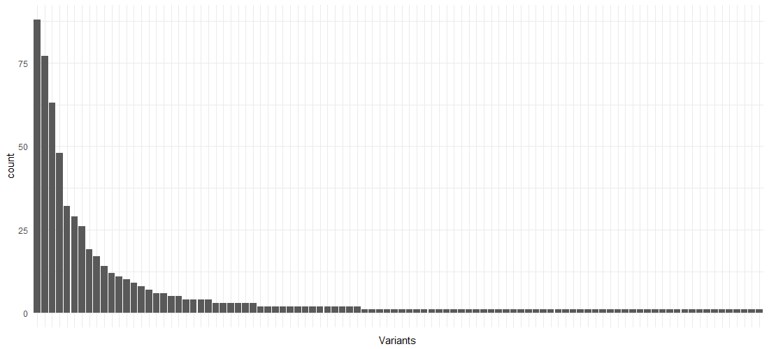
Next, let’s construct a smaller data set containing only the columns we’ll need to visualize our process maps. We’ll also calculate the event durations:
activities.basic <- eventlog %>%
 select(Case.ID, RowNum, Start, Complete, act=Activity) %>%
 mutate(Duration=Complete-Start)
We can now also derive all the arcs we need to put in our process map, with their durations:
edges.basic <- bind_rows(
   eventlog %>% select(Case.ID, a=RowNum, b=NextNum),
   eventlog %>% select(Case.ID, a=PrevNum, b=RowNum)) %>%
 filter(!is.na(a), !is.na(b)) %>%
 distinct %>%
 left_join(eventlog, by=c("a" = "RowNum"), copy=T, suffix=c("", ".prev")) %>%
 left_join(eventlog, by=c("b" = "RowNum"), copy=T, suffix=c("", ".next")) %>%
 select(Case.ID, a, b,
   a.act=Activity, b.act=Activity.next,
   a.start=Start, b.start=Start.next,
   a.complete=Complete, b.complete=Complete.next) %>%
 mutate(Duration=b.start-a.complete)
Again, this requires some considerate thinking. Even although a distinct list of (ActivityA-ActivityB)-pairs is sufficient to construct the process map, we do need to take into account the correct number of times an arc appears in order to calculate frequency and other metrics. We hence first merge the (Case Identifier, RowNum, NextNum) listing with (Case Identifier, PrevNum, RowNum) and filter out all entries where an endpoint of the arc equals NA. We then apply the “distinct” operator to make sure we get a unique listing, albeit at the row number level, and not at the activity name level. This makes sure our frequency counts remain correct. We can then figure out the endpoints per arc at the activity level by joining the event log on itself on both endpoints. We then select, per arc, the case identifier, endpoint row numbers (“a” and “b”), the activity names of the endpoints, the activity start and completion times of the endpoints, and the duration of the arc based on the endpoints, i.e. the waiting time of the arc.
This is all the information we need to start constructing process maps. Let’s start with a map showing the absolute frequencies of arcs and activities:
# For the activities, we only need the activity name and the frequency of occurrence per activity
activities.counts <- activities.basic %>%
 select(act) %>%
 group_by_all %>%
 summarize(metric=n())

# For the arcs, we now only need the activity names of the endpoints and the frequency of occurrence per such pair
edges.counts <- edges.basic %>%
 select(a.act, b.act) %>%
 group_by_all %>%
 summarize(metric=n())
We’ll use the excellent “igraph” package to visualize the process maps. Creating a graph layout is now very simple:
g <- graph_from_edgelist(edges.counts %>% select(a.act, b.act) %>% as.matrix(ncol=2))
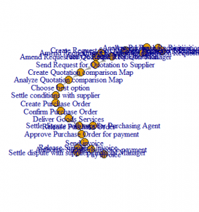
Plotting it directly in R, however, gives non-appealing results by default:
Sadly, “igraph”, like most graphing tools, is built with the assumption that graphs can be very unstructured (think social network graphs), so that the layout for process oriented graphs does not look very appealing. Luckily, “igraph” comes with powerful export capabilities that we can use to our benefit. Here, we’ll export our graphs to the dot file format and use “Graphviz” to perform the actual layout and generation of a resulting image. (Disco itself uses Graphviz under the hood as well to perform the layout of the process maps.)
We’ll first create a helper function to make this “dot plotting” a bit easier from R:
dot.plot <- function(g) {
 tmpfile <- tempfile(pattern='dot', fileext='.dot')
 print(tmpfile)
 g %>% write_graph(tmpfile, "dot")
 handle <- spawn_process('c:/graphviz/bin/dot.exe', c('-Tpng', '-O', tmpfile))
 Sys.sleep(5) # Sleep to make sure dot has finished
 pngimg <- readPNG(paste(tmpfile, '.png', sep=''))
 grid.raster(pngimg)
}
Before exporting our graph, we first apply some vertex (node) and edge attributes to make the resulting dot render a bit more appealing. To set labels on nodes and edges, dot uses the “label” attribute which we’ll set here to our previously calculated “metric” for the edges. For the activities, we set the label equal to the “vertex name” in igraph and append the metric after it.
g %<>%
 set_vertex_attr('fontsize', value='8') %>%
 set_vertex_attr('fontname', value='Arial') %>%
 set_vertex_attr('shape', value='box') %>%
 set_vertex_attr('label', value=paste(
 vertex_attr(., 'name'),
 activities.counts %>% .[match(vertex_attr(g, 'name'), .$act), ] %>% .$metric,
 sep='\n')) %>%
 set_edge_attr('label', value=edges.counts$metric)

dot.plot(g)
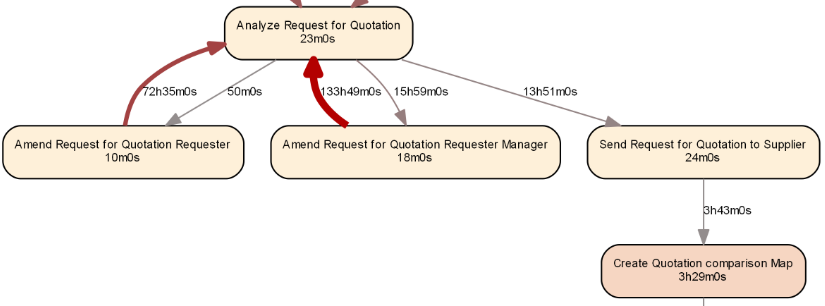
This results in a much better looking picture, which we can compare side-by-side with the Disco output to verify our results:
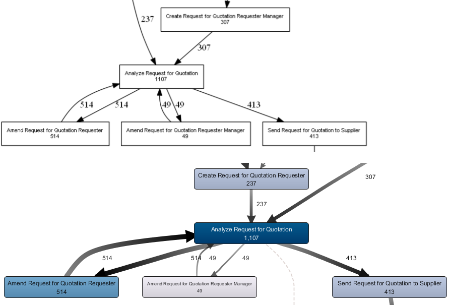
Side by side comparison of our process map created in R and the corresponding view in Disco (fragment). The metrics match for all activities and arcs.
Applying this procedure for other metrics is now done in a completely similar manner:
# Case frequencies: distinct frequencies per case-activity pair
activities.counts <- activities.basic %>%
 distinct(Case.ID, act) %>%
 select(act) %>%
 group_by_all %>%
 summarize(metric=n())

edges.counts <- edges.basic %>%
 distinct(Case.ID, a.act, b.act) %>%
 select(a.act, b.act) %>%
 group_by_all %>%
 summarize(metric=n())

# Max repetitions
activities.counts <- activities.basic %>%
 group_by(Case.ID, act) %>%
 summarise(metric=n()) %>%
 group_by(act) %>%
 summarise(metric=max(metric))

edges.counts <- edges.basic %>%
 group_by(Case.ID, a.act, b.act) %>%
 summarise(metric=n()) %>%
 group_by(a.act, b.act) %>%
 summarize(metric=max(metric))

# Median duration
activities.counts <- activities.basic %>%
 group_by(act) %>%
 summarize(metric=formatSeconds(as.numeric(median(Duration), units='secs')))

edges.counts <- edges.basic %>%
 group_by(a.act, b.act) %>%
 summarize(metric=formatSeconds(as.numeric(median(Duration), units='secs')))
Let us now try to make the median duration plot a bit more appealing. First, we’ll define two color gradients for the activities and edges respectively, as well as another small helper function:
col.box.red <- colorRampPalette(c('#FEF0D9', '#B30000'))(20)
col.arc.red <- colorRampPalette(c('#938D8D', '#B30000'))(20)

linMap <- function(x, from, to) (x - min(x)) / max(x - min(x)) * (to - from) + from
We can then use this function as follows:
activities.counts <- activities.basic %>%
 group_by(act) %>%
 summarize(metric=formatSeconds(as.numeric(median(Duration))),
 metric.s=as.numeric(median(Duration))) %>%
 ungroup %>%
 mutate(metric=ifelse(metric.s == 0, 'instant', metric),
 color=col.box.red[floor(linMap(metric.s, 1,20))])

edges.counts <- edges.basic %>%
 group_by(a.act, b.act) %>%
 summarize(metric=formatSeconds(as.numeric(median(Duration))),
 metric.s=as.numeric(median(Duration))) %>%
 ungroup %>%
 mutate(metric=ifelse(metric.s == 0, 'instant', metric),
 color=col.arc.red[floor(linMap(metric.s, 1, 20))],
 penwidth=floor(linMap(metric.s, 1, 5)))
And change the dot export to include some more attributes:
g <- graph_from_edgelist(edges.counts %>% select(a.act, b.act) %>% as.matrix(ncol=2))
g %<>%
 set_graph_attr('dpi', value='300') %>%
 set_vertex_attr('fontsize', value='8') %>%
 set_vertex_attr('fontname', value='Arial') %>%
 set_vertex_attr('shape', value='box') %>%
 set_vertex_attr('style', value='rounded,filled') %>%
 set_vertex_attr('label', value=paste(
   vertex_attr(., 'name'),
   activities.counts %>% .[match(vertex_attr(g, 'name'), .$act), ] %>% .$metric,
   sep='\n')) %>%
 set_vertex_attr('fillcolor', value=activities.counts %>%
   .[match(vertex_attr(g, 'name'), .$act), ] %>% .$color) %>%
 set_edge_attr('fontsize', value='8') %>%
 set_edge_attr('fontname', value='Arial') %>%
 set_edge_attr('label', value=edges.counts$metric) %>%
 set_edge_attr('color', value=edges.counts$color) %>%
 set_edge_attr('penwidth', value=edges.counts$penwidth)

dot.plot(g)
Resulting in the following, more appealing result:
Going Further
The road is now open for further expansion upon this basic framework. Some ideas for experimentation include:
- Filtering the event log and process map to show high-frequent behavior only
- Playing with different coloring, for instance not based on frequency or performance but also other interesting data attributes
- Expand the framework to include basic conformance checking, e.g. by highlighting deviating flows
- Applying decision mining (or probability measures) on the splits to predict which pathways will be followed
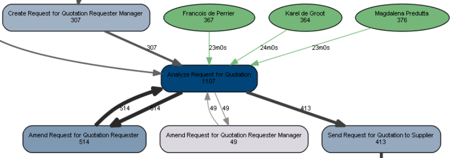
Let’s apply a simple extension as follows: say we’re interested in the “Analyze Request for Quotation” activity and would to bring in some more information with regards to this activity, starting from the resource attribute (i.e. the person who has executed this activity).
We’ll use absolute frequencies for most of the metrics, so let’s define some new colors:
col.box.blue <- colorRampPalette(c('#DBD8E0', '#014477'))(20)
col.arc.blue <- colorRampPalette(c('#938D8D', '#292929'))(20)
We then construct a basic overview of activities and their counts. We’ll immediately add in a color option we can use later on
activities.counts <- activities.basic %>%
 select(act) %>%
 group_by_all %>%
 summarize(metric=n()) %>%
 ungroup %>%
 mutate(fillcolor=col.box.blue[floor(linMap(metric, 1,20))])
We do the same for a basic overview of the arcs. We’ll add in arc colors, width, and metric as a character vector to use as the label later.
edges.counts <- edges.basic %>%
 select(a.act, b.act) %>%
 group_by_all %>%
 summarize(metric=n()) %>%
 ungroup %>%
 mutate(color=col.arc.blue[floor(linMap(metric, 1,20))],
 penwidth=floor(linMap(metric, 1, 5)),
 metric.char=as.character(metric))
Next up, we filter the event log for our activity under interest, calculate the duration, and then calculate frequency and performance metrics for each resource-activity pair that worked on this activity. We’ll use a single color for all arcs and a single width. We’ll use the performance metric to label these arcs.
acts.res <- eventlog %>%
 filter(Activity == "Analyze Request for Quotation") %>%
 mutate(Duration=Complete-Start) %>%
 select(Duration, Resource, Activity) %>%
 group_by(Resource, Activity) %>%
 summarize(metric.freq=n(), metric.perf=median(Duration)) %>%
 ungroup %>%
 mutate(color='#75B779',
 penwidth=1,
 metric.char=formatSeconds(as.numeric(metric.perf)))
Instead of constructing a graph as before, we’ll instead use the “graph_from_data_frame” function which is a bit easier to setup. This function expects a data frame of vertices (with all columns except for the first one automatically acting as attributes) and a data frame of edges (with all columns except for the first two acting as attributes).
First, we construct a data frame of vertices (activities) as follows. The fillcolor is set based on whether the node represents an activity (in which case we use the color we set above) or a resource (in which case we use a green color):
a <- bind_rows(activities.counts %>% select(name=act, metric=metric) %>% mutate(type='Activity'),
 acts.res %>% select(name=Resource, metric=metric.freq) %>% mutate(type='Resource')) %>%
 distinct %>%
 rowwise %>%
 mutate(fontsize=8,
 fontname='Arial',
 label=paste(name, metric, sep='\n'),
 shape=ifelse(type == 'Activity', 'box', 'ellipse'),
 style=ifelse(type == 'Activity', 'rounded,filled', 'solid,filled'),
 fillcolor=ifelse(type == 'Activity', activities.counts[activities.counts$act==name,]$fillcolor, '#75B779'))
We then construct a data frame for the edges as well:
e <- bind_rows(edges.counts,
 acts.res %>% select(a.act=Resource, b.act=Activity, metric.char, color, penwidth)) %>%
 rename(label=metric.char) %>%
 mutate(fontsize=8, fontname='Arial')
And plot the result:
gh <- graph_from_data_frame(e, vertices=a, directed=T)

dot.plot(gh)
Based on the result, we see that all three resources contributed about evenly to the execution of our activity, with their median execution times being similar as well:
Certainly, we now have a strong framework from which we can start creating richer process maps with more annotations and information.
Also check out bupaR, an R package for business process analytics in R developed by the Business Informatics research group at Hasselt University, Belgium..
Conclusion
In this article, we provided a quick whirlwind tour on how to create rich process maps using R.
As seen, this can come in helpful in cases where typical process discovery tools might not be available, but also provides hints on how typical process mining tasks can be enhanced by or more easily combined with other more data mining related tasks.
We hope you enjoyed reading this article and hope that can’t wait to see what you’ll do with your event logs.

