Contributed by: Michael Reusens, Wilfried Lemahieu, Bart Baesens, Luc Sels
This article first appeared in Data Science Briefings, the DataMiningApps newsletter. Subscribe now for free if you want to be the first to receive our feature articles, or follow us @DataMiningApps. Do you also wish to contribute to Data Science Briefings? Shoot us an e-mail over at briefings@dataminingapps.com and let’s get in touch!
In this short article, we will present an approach that allows us to better observe structures hidden in high dimensional data sets, by projecting them onto two dimensional (2D) images.
Data sets describing real-world entities are often high dimensional, making them hard to understand. Common questions about data, such as “What are the different types of movies available on Netflix?” or “Which users are we successfully targeting with our new data mining application?” can become hard to answer if there are many variables describing these data.
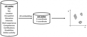
Dimensionality reduction techniques are the set of techniques that aim to lower the dimensionality (i.e. the number of features) of a dataset with a minimal loss of information. In our particular case, we aim at lowering the dimensionality of datasets containing hundreds (or even more) features down to 2 features: an x-coordinate, and a y-coordinate. This is also called 2D-embeddings. Look at the made-up example below. In this example, the goal of 2D-embeddings would be to lower the description of a job-seeker from tens of features, down to an x- and a y-coordinate so that each job seeker can be mapped onto a 2D image. An example observation of this made-up embedding would be that there are clearly three types of job seekers hidden in the data.
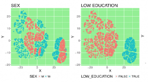
Below, you can see a real-life result of an experiment on 10,000 job seekers. By coloring the data based on user features, different regions of the embedding can be better understood. E.g. The region on the bottom right of the embedding can clearly be explained by the fact that here all the job seekers without higher education reside.
Loss of information is inevitable when going from a high-dimensional space to 2D. However, when creating a “world map” of a dataset, we want similar data to lie close together on the image, and dissimilar data to lie further apart. E.g.: job seekers with similar features should lie close together on the image, so that we can draw valid conclusions from it. This turns 2D-embedding of data into an optimization problem: what is the best way to lay out data on 2D plane so that similar data lie close together, and dissimilar data lie further apart?
Several solutions for this problem exist: Principal Component Analysis (PCA), Locally Linear Embedding, … and more recently t-distributed Stochastic Neighbor Embedding (t-SNE). All these techniques have as goal to satisfy the aforementioned optimization problem, but differ in what parts of the original information to focus on.
Below are some links to fascinating visualizations generated on complex data, using the t-SNE algorithm for 2D-embedding. Make sure to zoom in and inspect the images to fully grasp what is going on.
- The MNIST handwritten digit dataset: https://lvdmaaten.github.io/tsne/examples/mnist_tsne.jpg . You can clearly see that the equal digits groups together nicely.
- The olivetti faces dataset: https://lvdmaaten.github.io/tsne/examples/olivetti_tsne.jpg . Similar faces form groups in the embedding.
- A dataset from S&P containing the 500 top noted companies: https://lvdmaaten.github.io/tsne/examples/SP500_tsne.png . Similar companies are grouping together.
With this short article, we presented 2D-embeddings as a valuable tool that lets users gain insight in complex data.
In our own research, we are currently investigating how we can assure ourselves that patterns observed in the 2D-embeddings are caused by structure in the original data, and not by randomness. In other words: how can we make sure that our eyes do not fool us?
References
- Laurens van der Maaten, https://lvdmaaten.github.io/tsne (accessed 01/06/2017)


